こんにちは、 ゴーリストのビベックです。
Hello World! This is Vivek from Goalist.
If you want to build a very powerful machine learning algorithm on structured data then the first step to take is to explore the data every which way you can. You draw a Histogram; you draw a Correlogram; you draw Cross Plots, you really want to understand what is in that data what does each variable mean, what's its distribution ideally how was it collected.
Once you have a real rock solid understanding of what's in the data, only then can you smoothly move into creating your machine learning model.

In this post, let's go through the different libraries in Python and gain some insight into our data by visualizing it.
Along with me, you may want to try and experiment with the packages that we are about to explore. Use Google Colab to follow along.
Well, you may ask what is Google Colab?
Colaboratory is a free Jupyter notebook environment that requires no setup and runs entirely in the cloud.
With Colaboratory you can write and execute code, save and share your analyses, and access powerful computing resources, all for free from your browser.
Learn more about Google Colab here…
Follow this URL to create your notebook
So let's get started…
We'll be using the following packages to plot different graphs
- Matplotlib
- Seaborn
- Bokeh
Out of these, Matplotlib is the most common charting package, see its documentation for details, and its examples for inspiration.
1) Line Graphs
A line graph is commonly used to show trends over time. It can help readers to understand your data in a few seconds.

Sample code to generate a Line Graph is given below. Go ahead and open the sample code in Colab and experiment with it.
2) Bar Charts
Bar graphs, also known as column charts, use vertical or horizontal bars to represent data along both an x-axis and a y-axis visually. Each bar represents one value. When the bars are stacked next to one another, the viewer can compare the different bars, or values, at a glance.

Sample code to generate a Bar Chart and 3D Bar Chart is given below.
3) Histogram
A histogram is used to summarize discrete or continuous data. In other words, it provides a visual interpretation of numerical data by showing the number of data points that fall within a specified range of values (called "bins").
It is similar to a vertical bar graph. However, a histogram, unlike a vertical bar graph, shows no gaps between the bars.

4) Scatter Plots
Scatter Plot is a graph in which the values of two variables are plotted along two axes, the pattern of the resulting points revealing any correlation present.

Sample code to generate a Scatter Plot and 3D Scatter Plot is given below.
5) Pie Charts
A pie chart (or a circle chart) is a circular statistical graphic, which is divided into slices to illustrate numerical proportion. In a pie chart, the arc length of each slice (and consequently its central angle and area), is proportional to the quantity it represents.

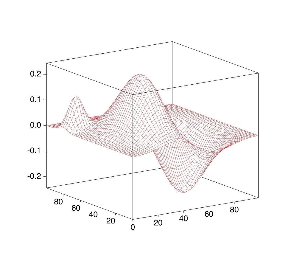
6) Wireframe Plots
Wireframe plots are used to graphically represent skeletal sketches of functions defined over a rectangular grid. Geographic data is an example of where this type of graph would be used.

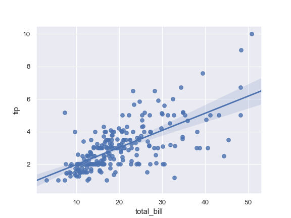
7) Regplot
Regplot is a simple scatterplot with a nice regression line fit to it.
We'll use Seaborn's regplot to draw Regplot

Seaborn is a Python data visualization library based on matplotlib. It provides a high-level interface for drawing attractive and informative statistical graphics.
Here are some more examples of Seaborn for inspiration
8) HeatMap
A heat map is a graphical representation of data where the individual values contained in a matrix are represented as colors. Github's contribution calendar is an example of a heatmap.

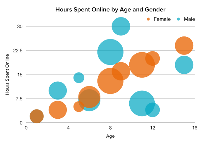
9) Bubble Chart
A bubble chart is similar to a scatter plot in that it can show distribution or relationship. There is a third data set, which is indicated by the size of the bubble or circle.

To draw an interactive bubble chart let's use bokeh
Bokeh is an interactive visualization library that targets modern web browsers for presentation. Its goal is to provide elegant, concise construction of versatile graphics, and to extend this capability with high-performance interactivity over very large or streaming datasets. Bokeh can help anyone who would like to quickly and easily create interactive plots, dashboards, and data applications.
That's all for this post see you soon with one of such next time; until then,
Happy Learning :)